Start with structure
I organised content and page hierarchies before refining the visual layer, making each experience easier to scan, navigate and extend.
- Information hierarchy
- Page architecture
- Clear interaction states
Case study 03 · Web, commerce & product UI · Australia
Three digital contexts, connected by clarity and production-ready design.
Work across OPPOSITE, Collaborative People and Simplify showing how I move from visual direction to responsive WordPress implementation and developer-ready UI.
Overview
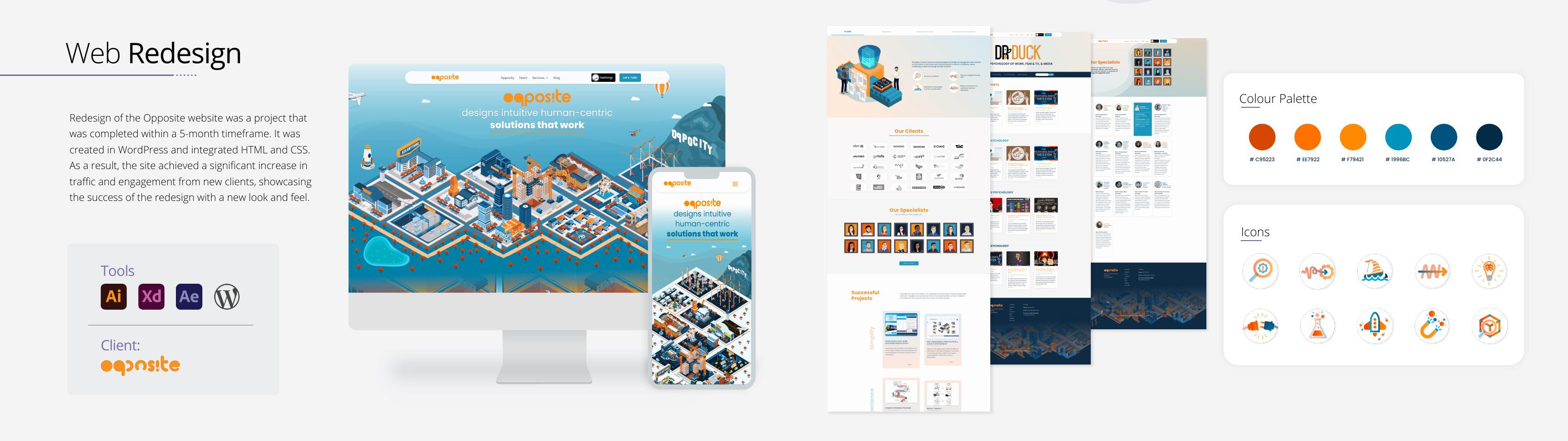
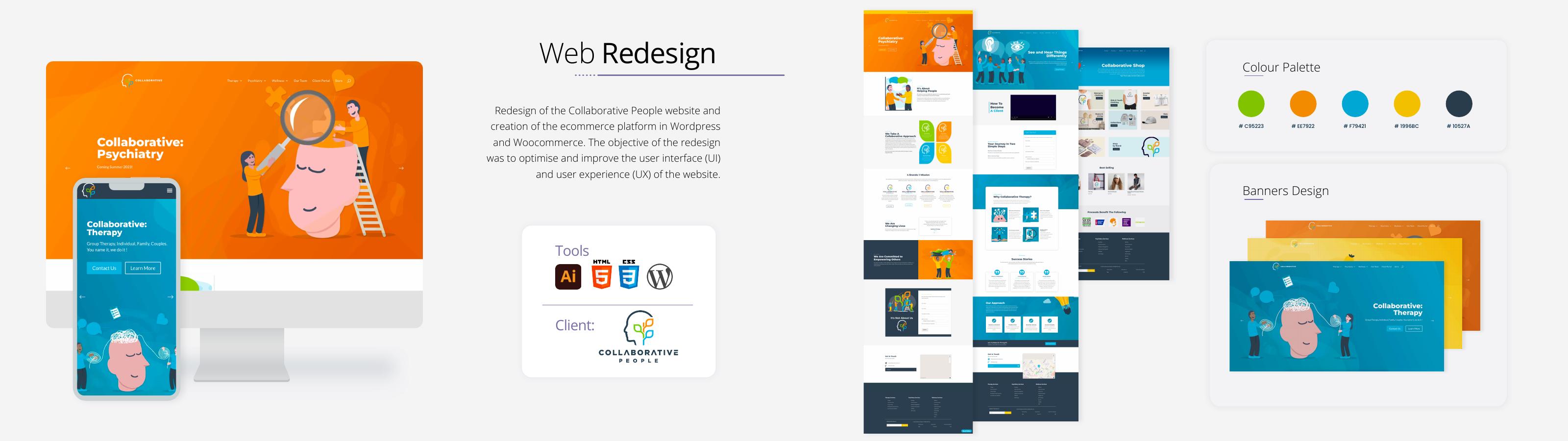
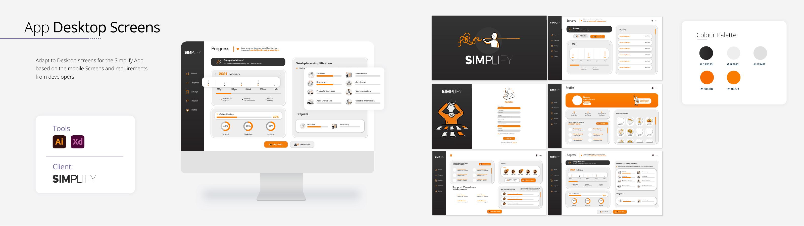
These projects sit where brand, content, interface design and implementation meet: a corporate website redesign, a WordPress/WooCommerce experience and a desktop application UI.
Each turned complex material into a clear experience. For the web work, I also carried approved designs into responsive production.
Evidence of delivery
End-to-end OPPOSITE website redesign
Distinct digital systems in one selected case
Design carried into WordPress implementation
Web, product UI, email and campaign support
The challenge
OPPOSITE needed a renewed digital presence, Collaborative People needed web and commerce functionality, and Simplify required clear desktop interfaces developers could build.
The work required information hierarchy, practical WordPress knowledge and clear communication across marketing, project and development teams.
Key design decisions
I organised content and page hierarchies before refining the visual layer, making each experience easier to scan, navigate and extend.
For the five-month OPPOSITE redesign, I established responsive page patterns that created consistency without making the site feel repetitive.
I translated approved layouts into live pages with HTML/CSS refinements, responsive QA and attention to hierarchy and interaction.
Web pages, WooCommerce journeys, product screens and HubSpot emails each needed clarity within different constraints.
The connected system
I can define the visual experience, understand how it should behave and help carry it into a live result.
Corporate WordPress system
Web + WooCommerce
Desktop application UI
HubSpot + digital assets
Cross-functional collaboration
I worked with stakeholders, marketers, project managers and developers to turn requirements into clear interfaces and make practical decisions within platform and timeline constraints.
Outcome
I can transform visual direction into a clear, responsive WordPress experience.
I can preserve design fidelity while working inside real platform constraints.
I can adapt UI thinking across websites, commerce, product screens and email.
I can communicate clearly with both creative and technical collaborators.